
Focus Garden - Modernizing an ecommerce experience for a growing gardening retailer
UX/UI Audit
E-commerce
UX/UI Redesign
Competetive Analysis
Filtering
PDP
Navigation
Categories
Role:
Senior UX/UI Designer
Scope:
UX/UI, Research
Timeline:
2 months
Platform:
Web/RWD
Agency:
Unravel
Year:
2024
Project overview
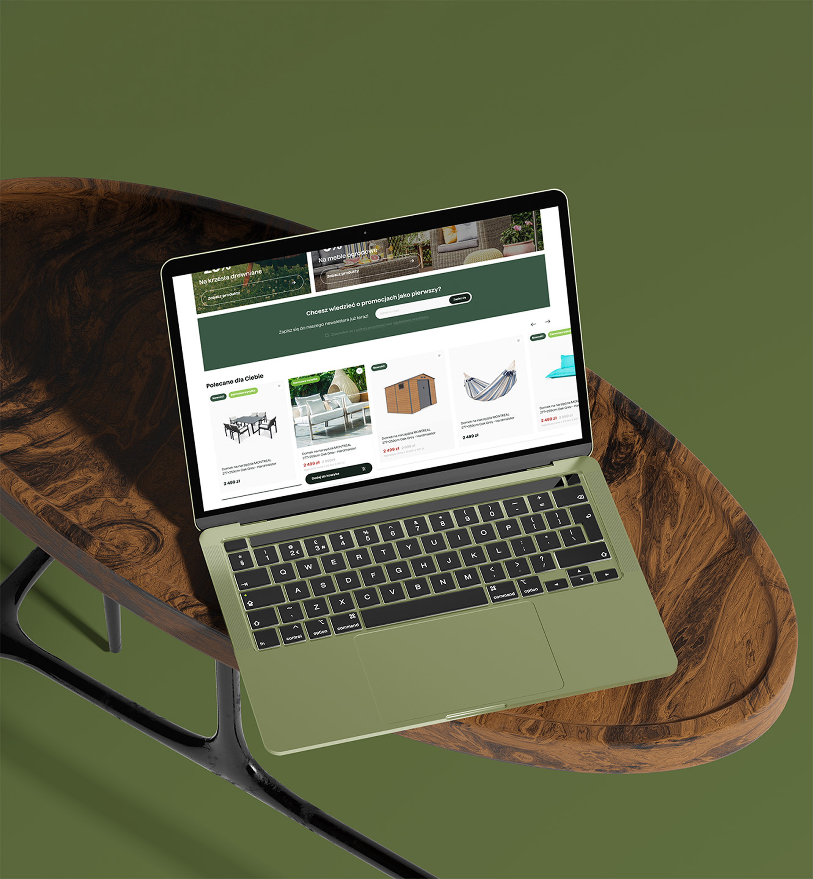
Focus Garden offers a wide range of gardening, outdoor living and home improvement products, ranging from plants and tools to outdoor furniture, saunas and pools.
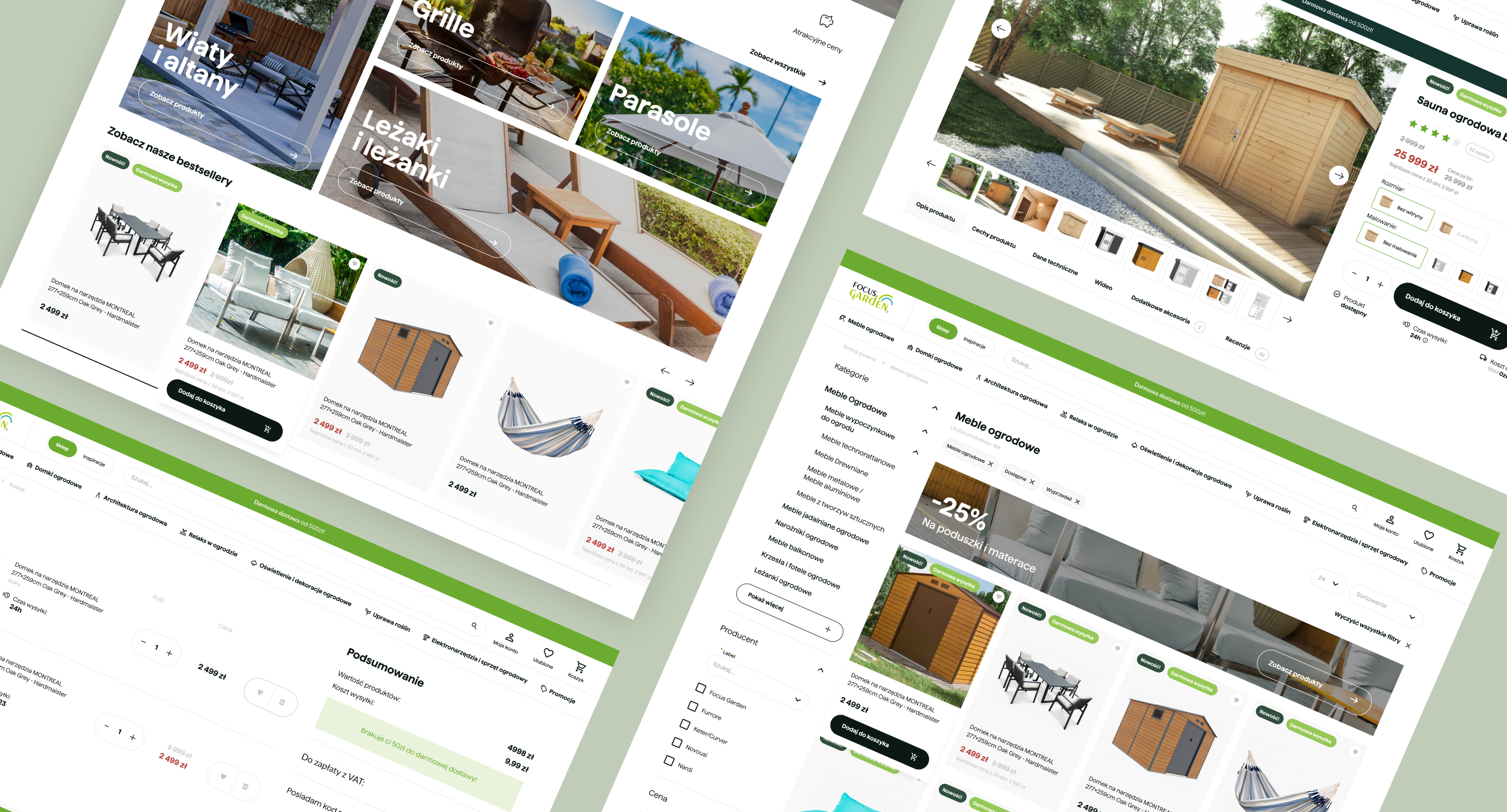
The existing store no longer reflected the company's evolving brand and suffered from several usability issues that made product discovery and purchasing unnecessarily difficult.
The existing store no longer reflected the company's evolving brand and suffered from several usability issues that made product discovery and purchasing unnecessarily difficult.
The challenge
Finding products was harder than it should be
The store relied on an outdated category structure with too many top-level categories and poor navigation patterns.
Configurable products created friction
Users could customize products through different variants, add-ons and installation services, but the experience lacked clarity and resulted in drop-offs.
The visual experience felt outdated
The redesign also needed to support a company-wide rebranding effort while modernizing the shopping experience.
The store relied on an outdated category structure with too many top-level categories and poor navigation patterns.
Configurable products created friction
Users could customize products through different variants, add-ons and installation services, but the experience lacked clarity and resulted in drop-offs.
The visual experience felt outdated
The redesign also needed to support a company-wide rebranding effort while modernizing the shopping experience.
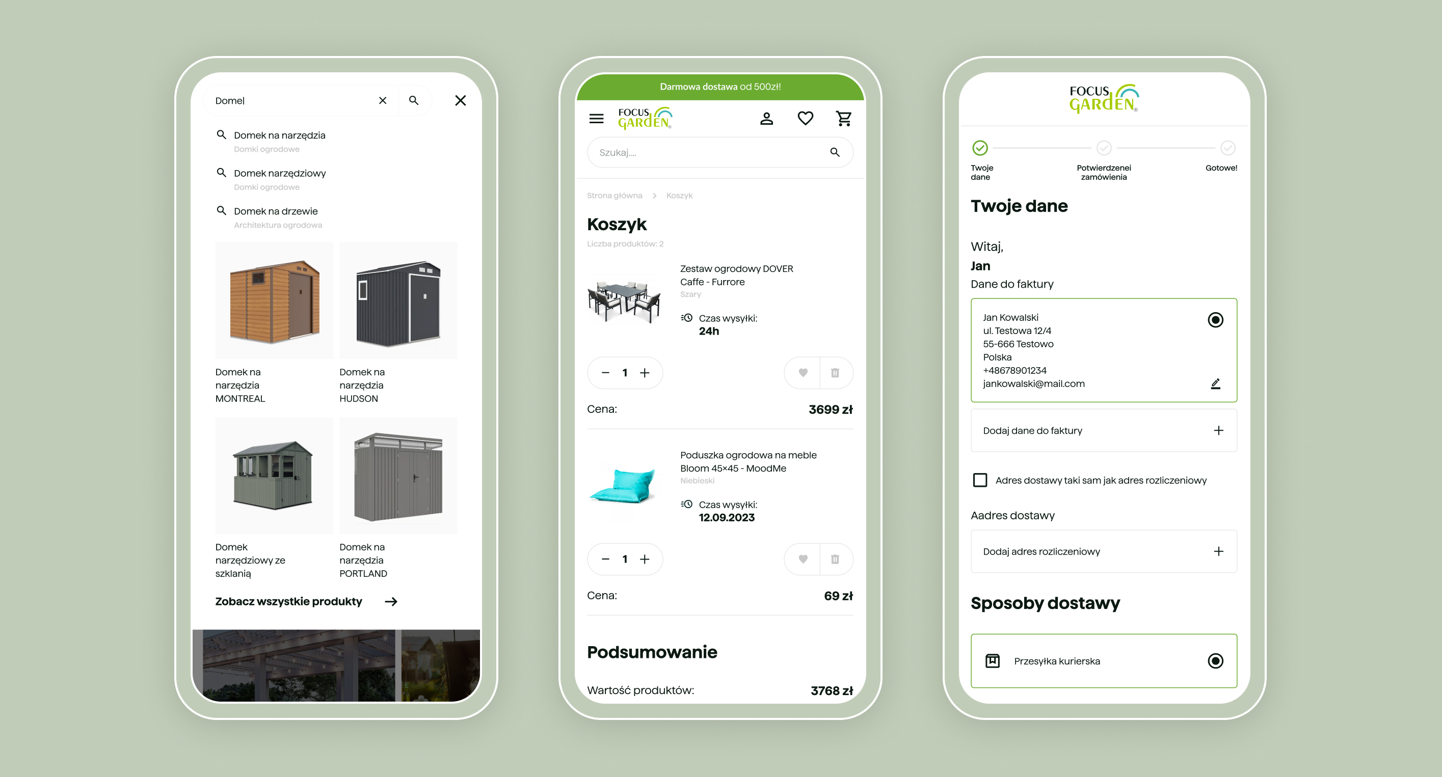
Improving product discovery
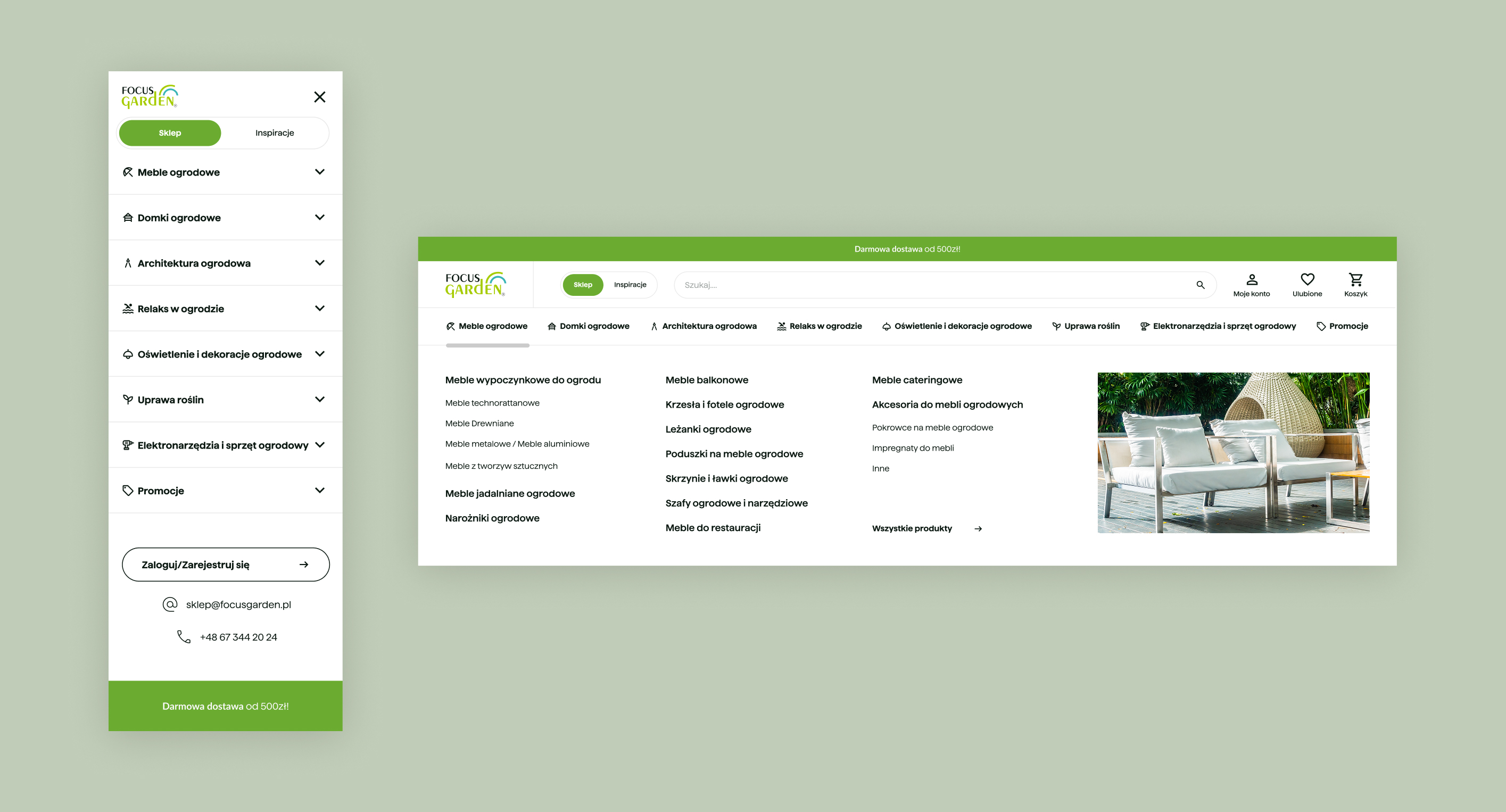
I simplified the information architecture by reducing the number of top-level categories and making key product groups accessible immediately.
Additional improvements included:
- redesigned mega menu
- improved category hierarchy
- smart search
- better filtering experience
Result: faster access to products and clearer navigation paths.
Additional improvements included:
- redesigned mega menu
- improved category hierarchy
- smart search
- better filtering experience
Result: faster access to products and clearer navigation paths.
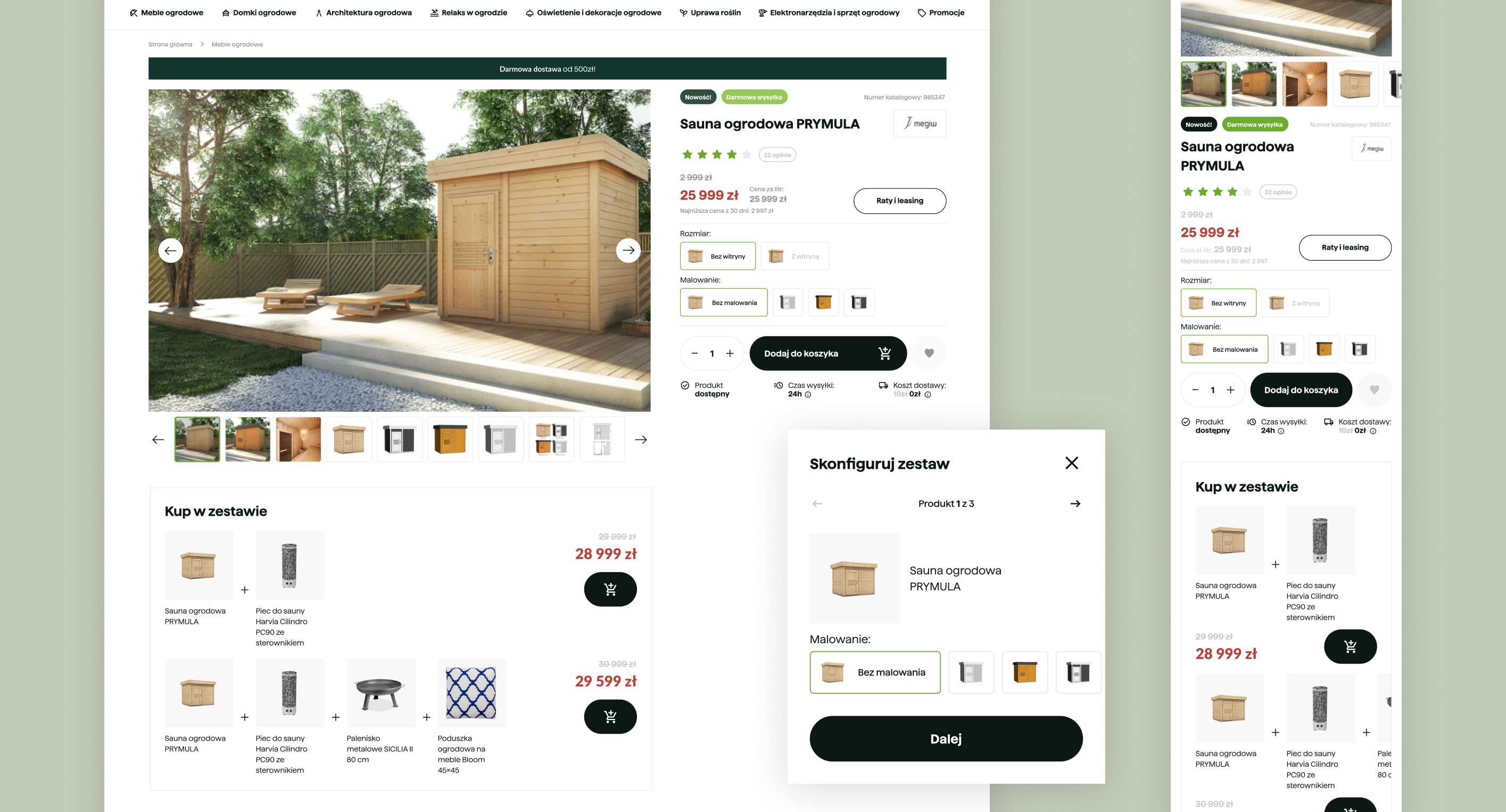
Simplifying configurable products
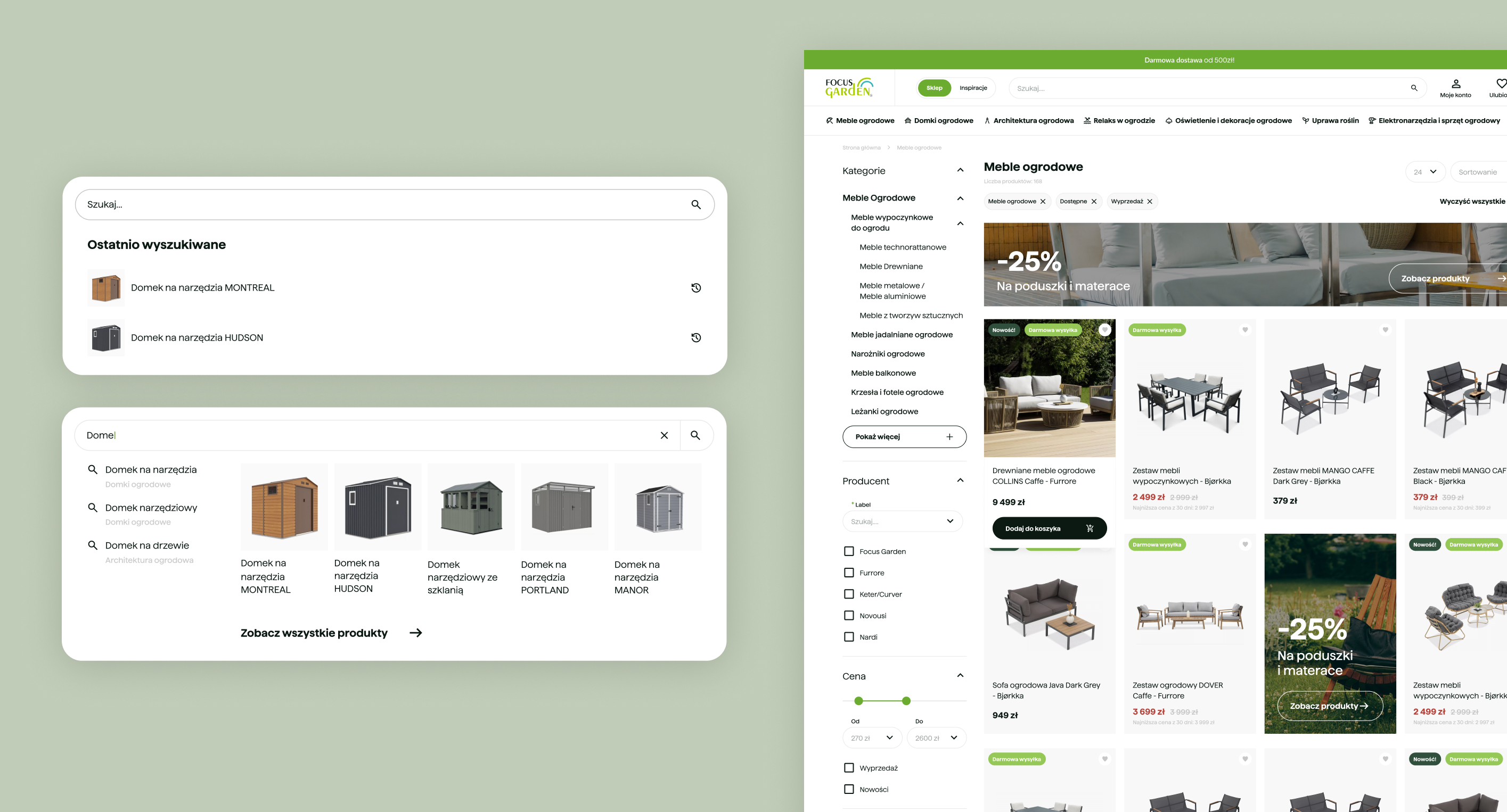
One of the largest friction points occurred on customizable products.
I redesigned the product page to better structure:
- variants and dimensions
- installation services
- complementary products
- predefined bundles
The goal was to help users understand available options without overwhelming them.
Result: a clearer configuration experience and lower purchase friction.
I redesigned the product page to better structure:
- variants and dimensions
- installation services
- complementary products
- predefined bundles
The goal was to help users understand available options without overwhelming them.
Result: a clearer configuration experience and lower purchase friction.
Supporting the new brand direction
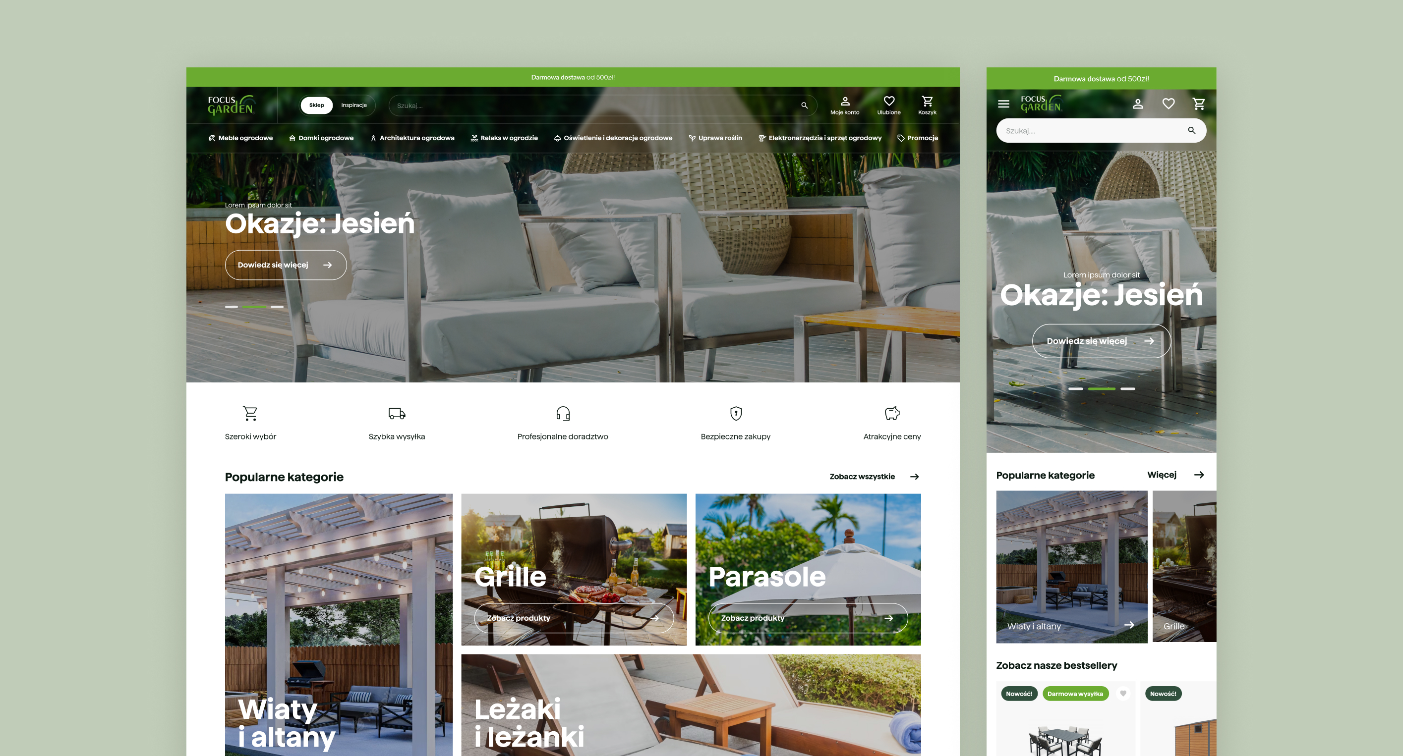
The redesign introduced a more contemporary visual language aligned with the company's new branding while improving responsiveness across devices.
Changes included:
- refreshed visual hierarchy
- updated typography and colors
- stronger promotional sections
- mobile-first improvements
Changes included:
- refreshed visual hierarchy
- updated typography and colors
- stronger promotional sections
- mobile-first improvements
Outcome
The redesign was fully implemented and positively received by the client.
According to post-launch feedback:
- conversion rates improved
- bounce rates decreased in key purchase flows
- the updated experience aligned successfully with the new brand direction
According to post-launch feedback:
- conversion rates improved
- bounce rates decreased in key purchase flows
- the updated experience aligned successfully with the new brand direction
Reflection
With more time, I would further explore product configuration patterns and validate alternative approaches for bundled products and add-on services.
51
Unique desktop screens
61
Unique mobile screens
+100
Design system components
39
Text and color styles
+40
Pages of research & audit reports
Want to create something cool together or have any questions?
hello@iamszu.com


