Bitskins - Redesigning a digital marketplace to reduce friction for high-frequency traders
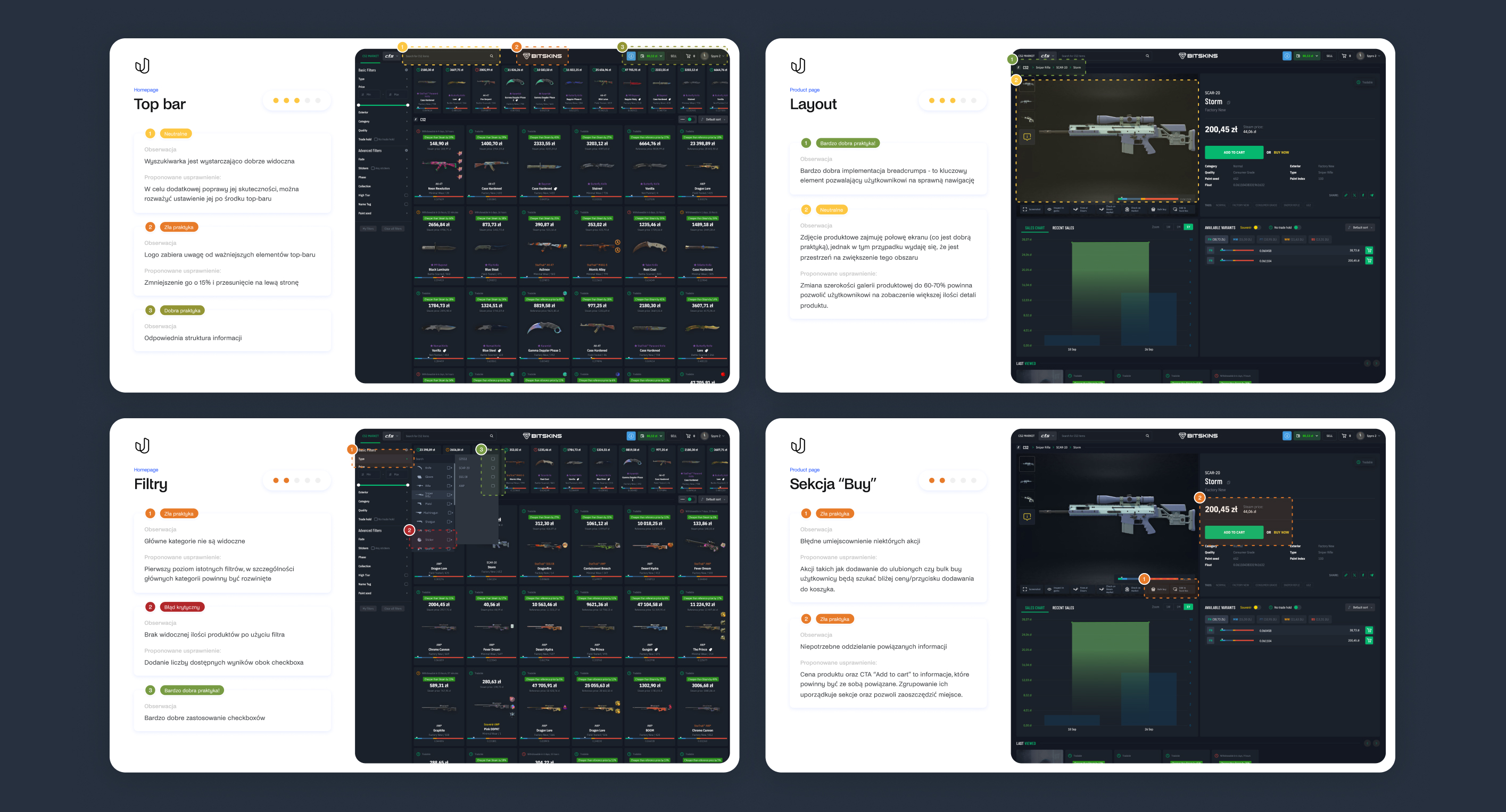
UX/UI Audit
Marketplace
UX/UI Redesign
Competetive Analysis
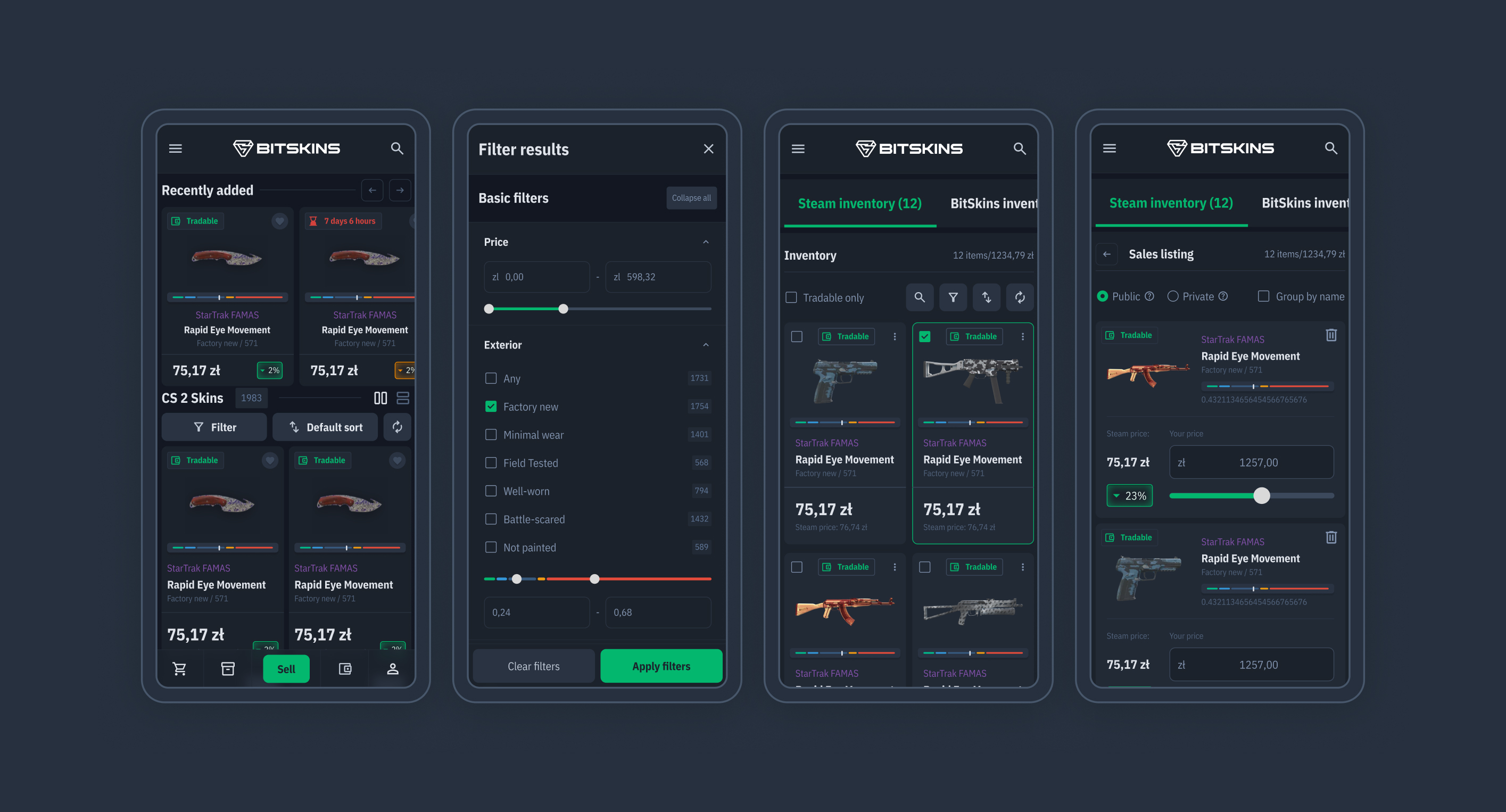
Filtering
PDP
Inventory

Role:
Product Designer
Scope:
UX/UI, Research
Timeline:
2 months
Platform:
Web/RWD
Agency:
Unravel
Year:
2024
Project overview
Bitskins is a large marketplace for virtual gaming items where speed, discoverability and trust directly influence buying behavior.
As the platform grew, UX complexity increased - making filtering, inventory management and product discovery harder than necessary.
As the platform grew, UX complexity increased - making filtering, inventory management and product discovery harder than necessary.
The challenge
Product discovery felt slow
Filters and category access lacked structure.
The experience was cluttered
Product cards and PDPs contained weak hierarchy and hidden actions.
Power-user workflows created friction
Inventory and account management were difficult to understand.
Goal: Improve discoverability, reduce friction and make the platform more competitive.
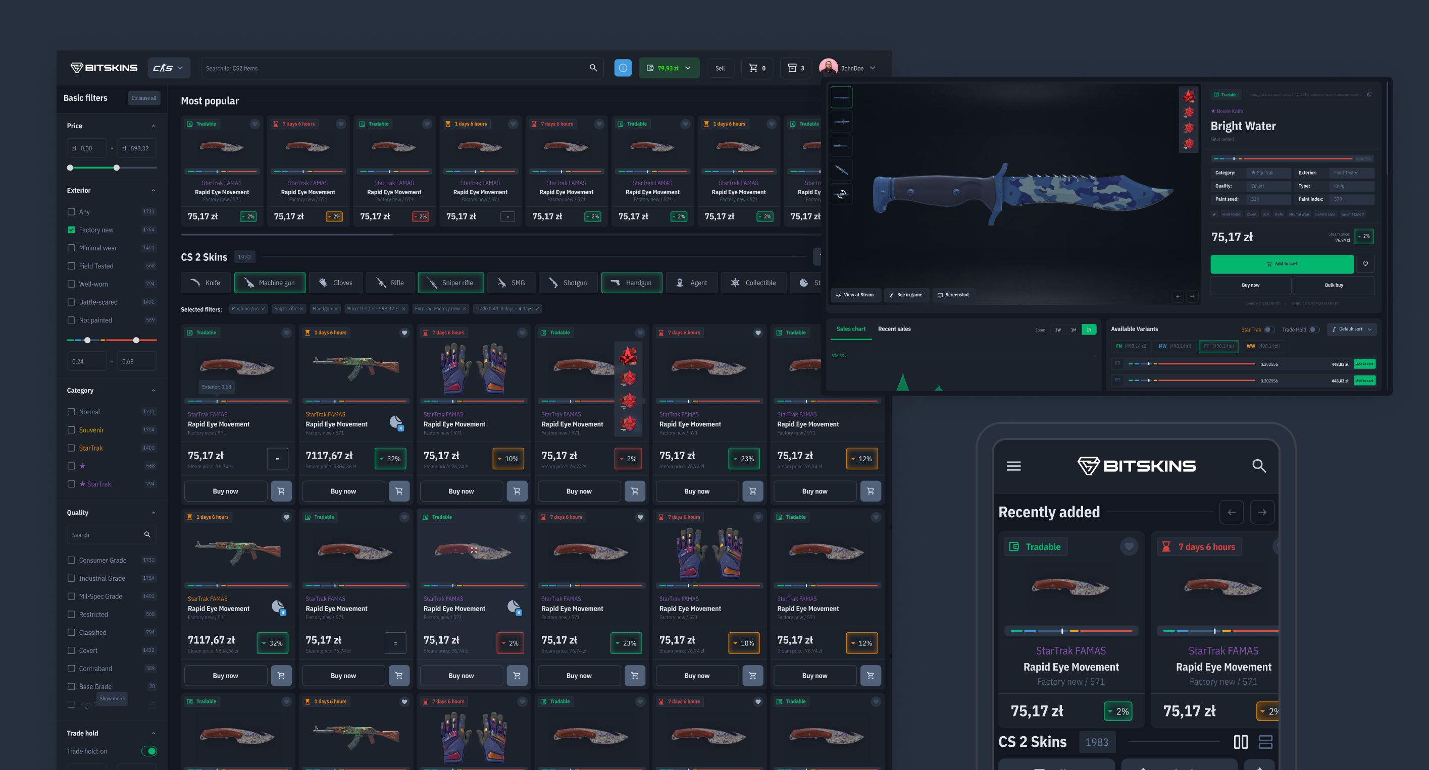
Marketplace discovery
Making discovery faster
The marketplace listing became the core focus of the redesign.I reworked filtering using familiar ecommerce patterns and introduced:
- quick category shortcuts
- expandable filters
- result counts
- search inside large filter groups
- basic vs advanced filtering
Result: faster browsing and clearer product discovery.
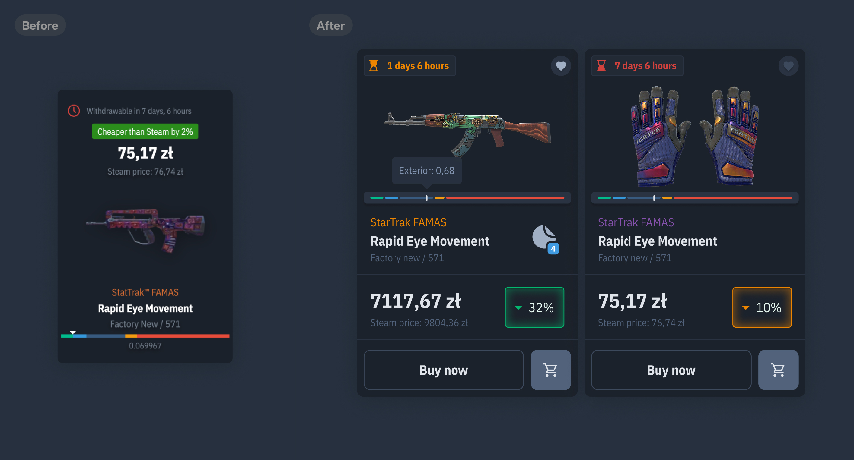
Product cards
Improving scanability
The original product cards had weak hierarchy and hidden actions.I redesigned thumbnails to surface the information traders care about most:
- clearer information hierarchy
- isible quick actions
- stronger price visibility
- platform vs market comparison
Result: easier product comparison and faster decision-making.
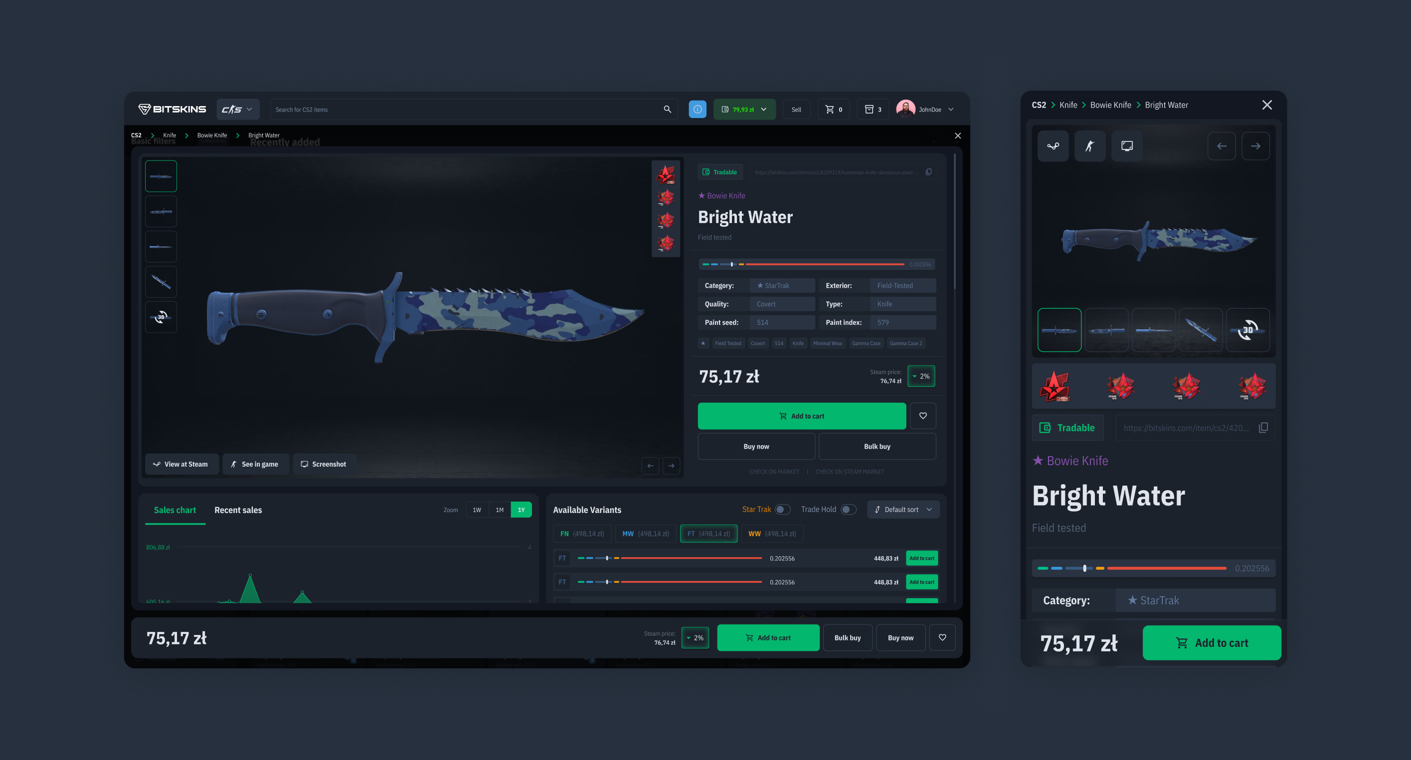
Modal product page
Preserving browsing context
Users frequently compare multiple products before making a purchase. Instead of redirecting to a separate page, product details open inside a modal while preserving marketplace context.
Marketplace → Inspect → Buy/Continue browsing
Each modal kept a shareable URL, preserving the benefits of a traditional product page without interrupting browsing.
Result: faster product inspection with less friction.
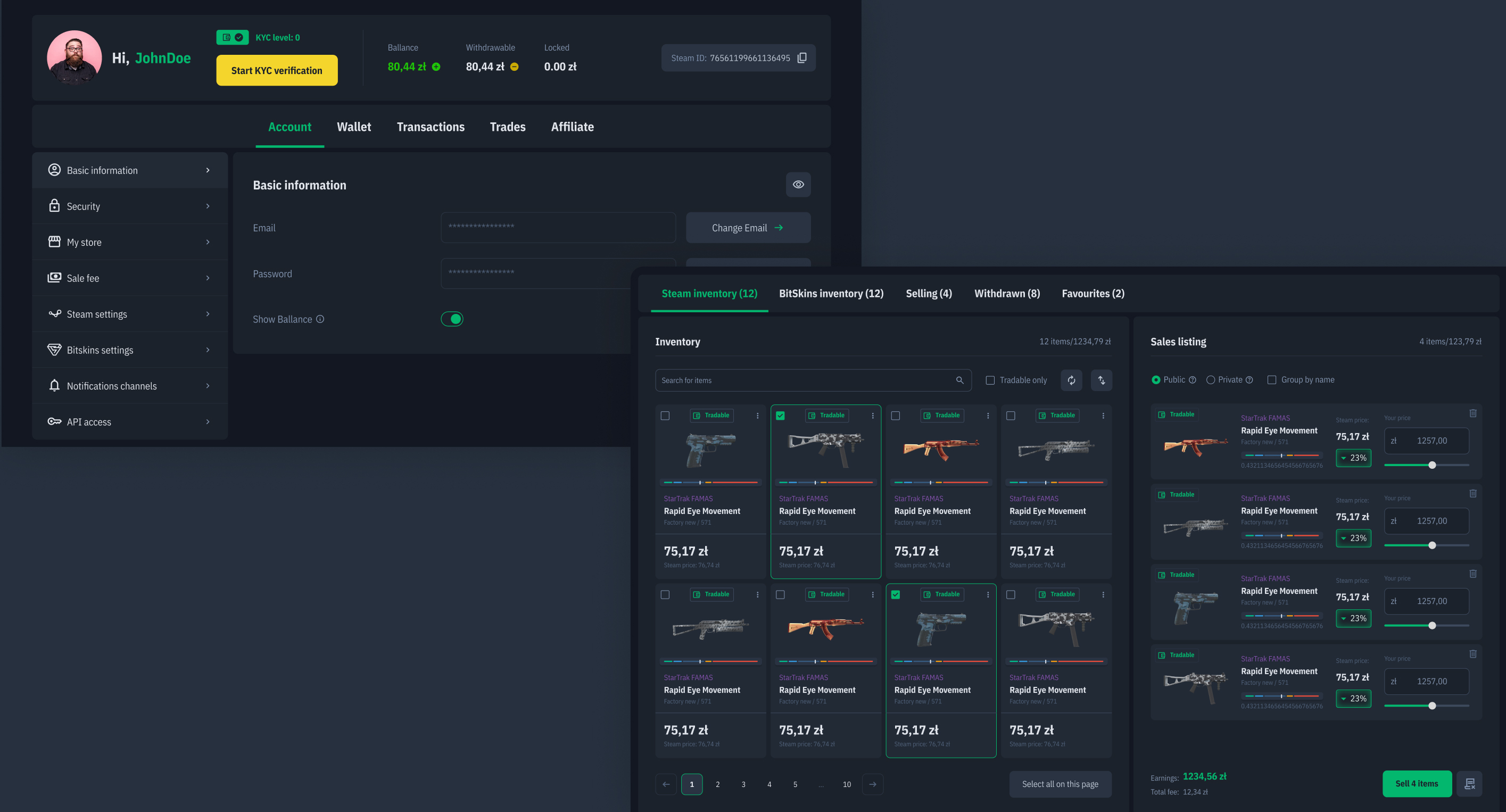
Account & inventory
Simplifying complex workflows
The account experience moved from cluttered layouts to clearer task-based sections. Inventory flows were redesigned to make selling and withdrawing items easier to understand and more predictable.
Result: clearer workflows and lower cognitive load for frequent users.
The account experience moved from cluttered layouts to clearer task-based sections. Inventory flows were redesigned to make selling and withdrawing items easier to understand and more predictable.
Result: clearer workflows and lower cognitive load for frequent users.
Mobile
Although mobile represented a smaller audience, the experience was redesigned with more app-like navigation and improved usability.
Outcome
The redesign was fully implemented and positively received during beta testing. Feedback suggested:
- easier product discovery
- improved inventory usability
- better clarity for experienced traders
- positive response to redesigned product cards
- easier product discovery
- improved inventory usability
- better clarity for experienced traders
- positive response to redesigned product cards
Reflection
With more time, I would invest deeper in trader behavior and refine advanced workflows such as filtering and inventory management.
41
Redesigned desktop screens
48
Redesigned mobile screens
26
Pages long competetive analysis report
39
Pages long audit report
15
Users interviewed
Want to create something cool together or have any questions?
hello@iamszu.com