RideCraft - Designing a connected transportation platform for operational clarity
Product Design
UX/UI Design
Web App
Mobile App
Interaction Design
Shared Design System
Prototyping
Role:
Product Designer
Scope:
UX/UI, Research, Prototyping
Timeline:
10 months
Platform:
Web/RWD + Mobile Apps (Flutter)
Agency:
itCraft
Year:
2025-2026
Project overview
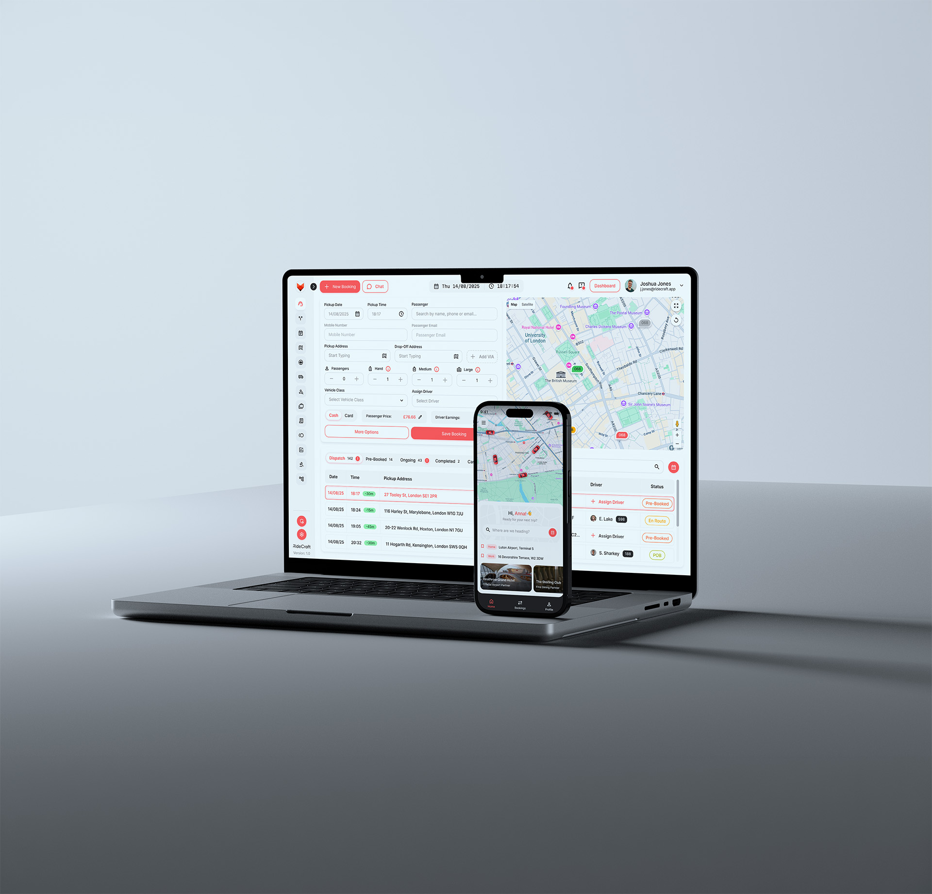
RideCraft was built to replace fragmented transportation tools with a single ecosystem for dispatchers, drivers and passengers.
The challenge wasn’t only interface design - it was simplifying operational complexity across booking, pricing, dispatching and ride management.
The challenge wasn’t only interface design - it was simplifying operational complexity across booking, pricing, dispatching and ride management.
The challenge
Existing tools forced transportation companies into compromises
Most competing products solved only parts of the workflow:
- fragmented operational tooling
- outdated UX and weak mobile experiences
- poor flexibility for complex transport businesses
- expensive systems with missing capabilities
The goal was to create one connected ecosystem that supports dispatching, bookings, ride orchestration, pricing and customer management.
Operational clarity
High information density without overwhelming dispatchers
Dispatchers operate under time pressure and constantly manage multiple rides, drivers and customer requests. The challenge was balancing information density with clarity.
The operator view combined:
- segmented ride states
- contextual details
- map + operational data
- progressive disclosure through ride details
Instead of overwhelming users with all information at once, complexity was layered progressively.
Smart search
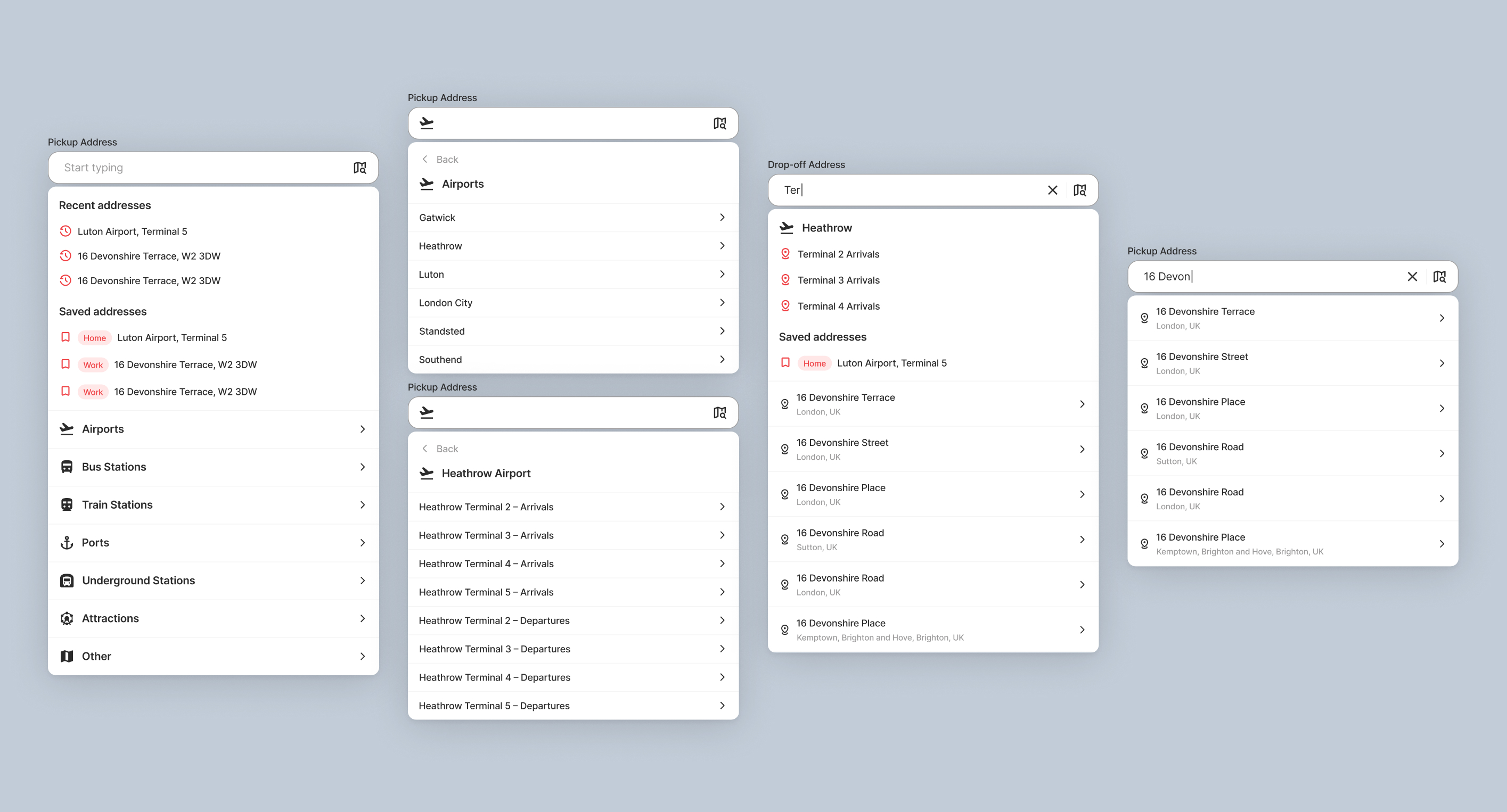
Accelerating booking creation
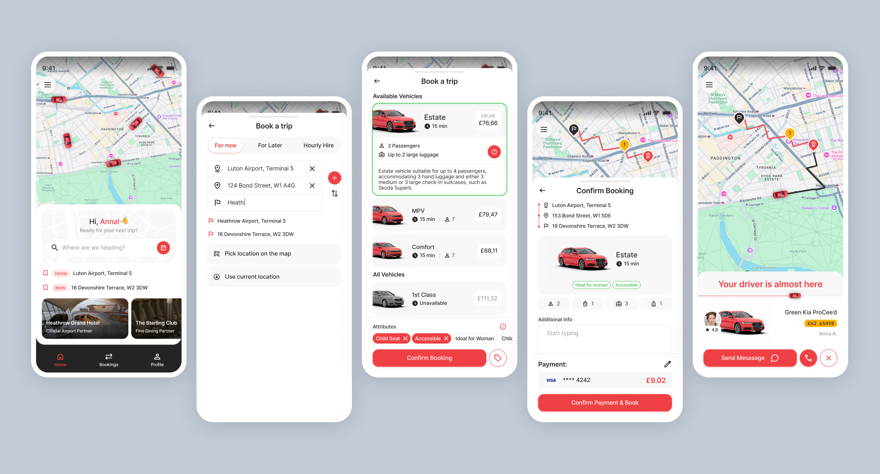
Dispatchers repeatedly search for the same destinations throughout the day. Standard address search alone wasn’t enough. I designed a contextual smart search that combines:
- Google Maps suggestions
- passenger history
- saved addresses
- predefined company locations
Predefined locations introduced nested logic:
Airports → Airport → Terminal
Several interaction models were explored through prototypes before settling on a navigation pattern optimized for speed and clarity. Marketplace-style nested menus and column layouts were rejected in favor of a simpler step-by-step navigation model.
Goal: reduce friction during high-frequency booking workflows.
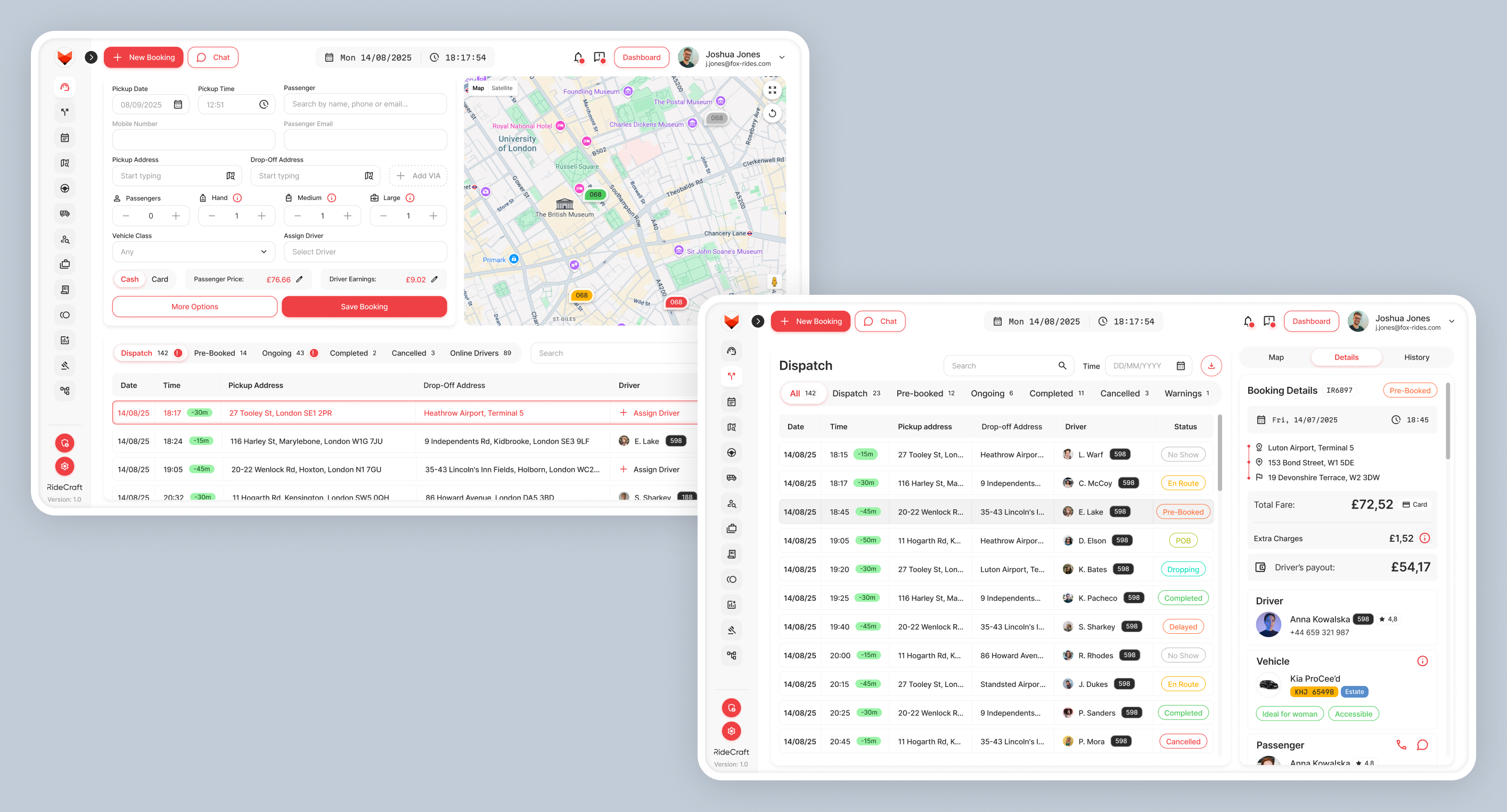
Booking flow
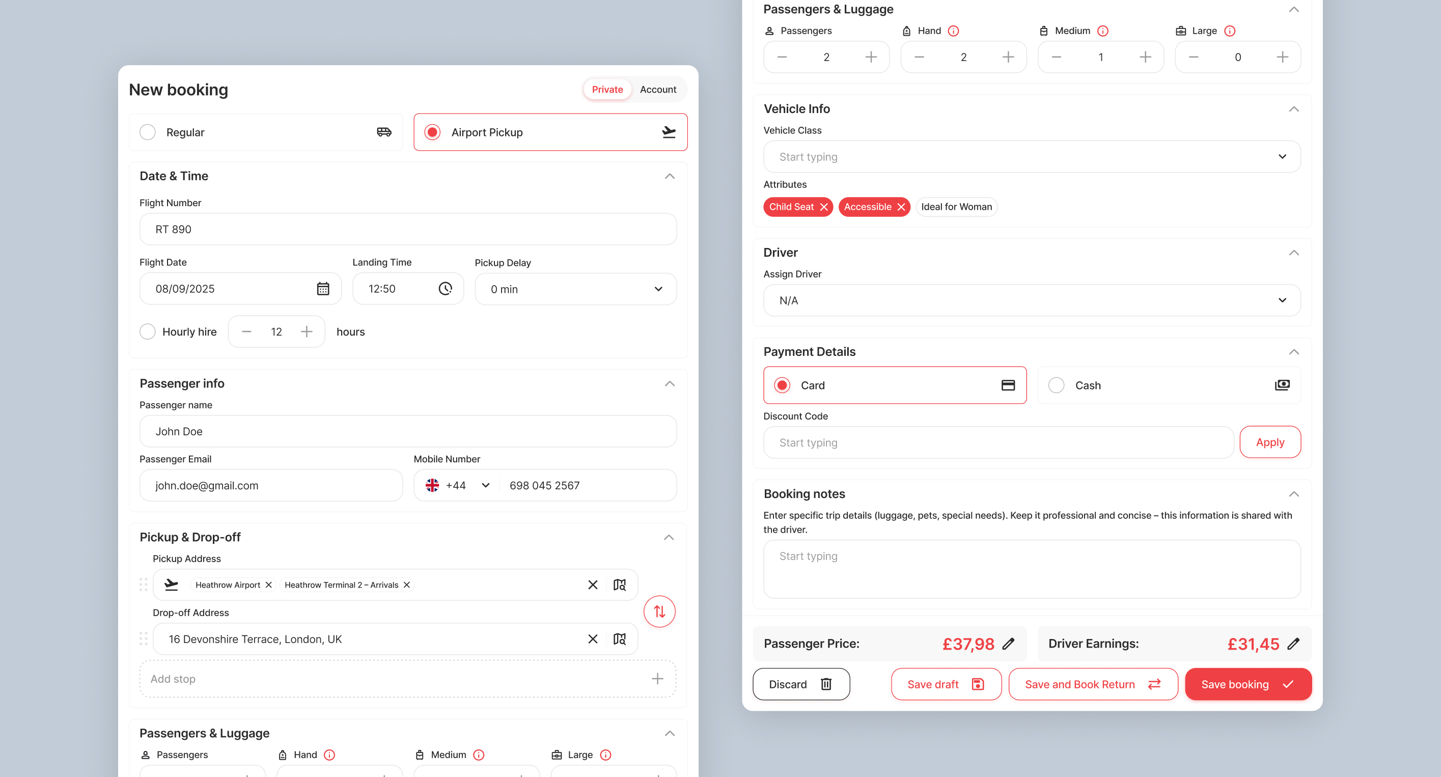
Simplifying booking complexity
Booking required many dependencies and conditional states. Instead of exposing every option immediately, the flow was redesigned around operational logic.
Examples:
- passenger before addresses (saved history dependency)
- luggage before vehicle class (capacity dependency)
- vehicle before driver (availability dependency)
Complexity was reduced through hierarchy, sequencing and progressive disclosure.
Ride type → Time → Passenger → Locations → Luggage → Vehicle → Driver → Payment
Complex workflows
Operational tools required advanced logic without overwhelming users.
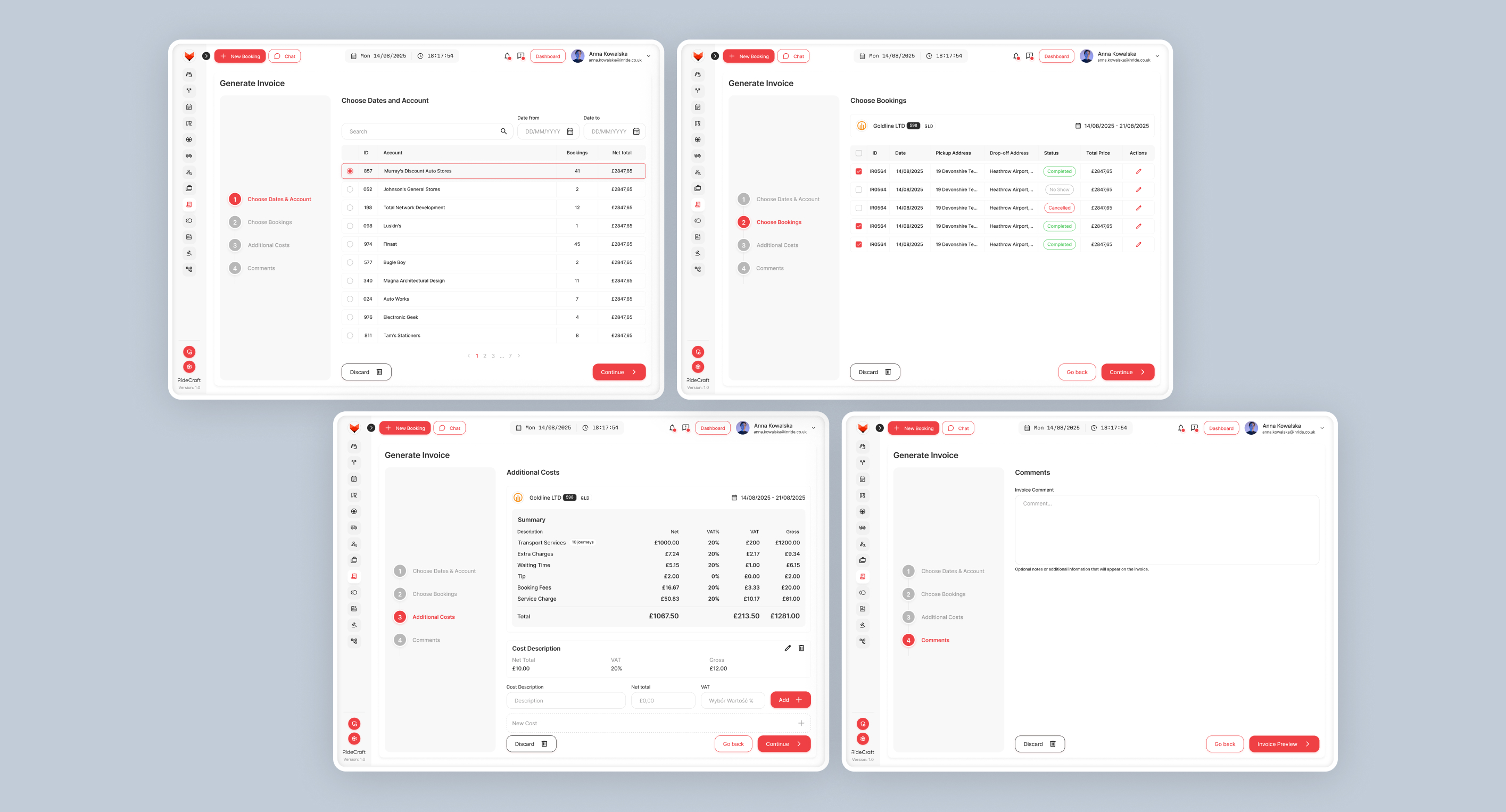
Invoice wizard
Invoice creation was redesigned into a structured step-by-step flow:
Date range → Company → Rides → Additional costs → Review → Send
This reduced cognitive load while keeping advanced flexibility.
Pricing system
Pricing combined multiple variables:distance, time, zones, waiting time, modifiers, hourly hire and promotions.
Instead of exposing technical complexity, pricing was organized into modular and predictable structures.
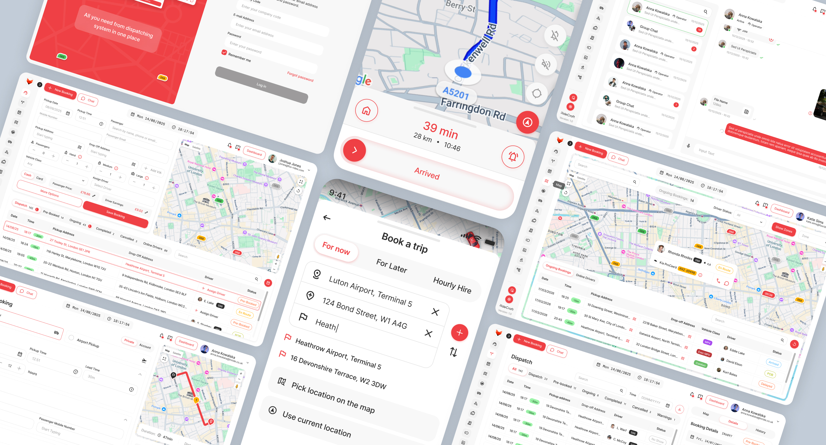
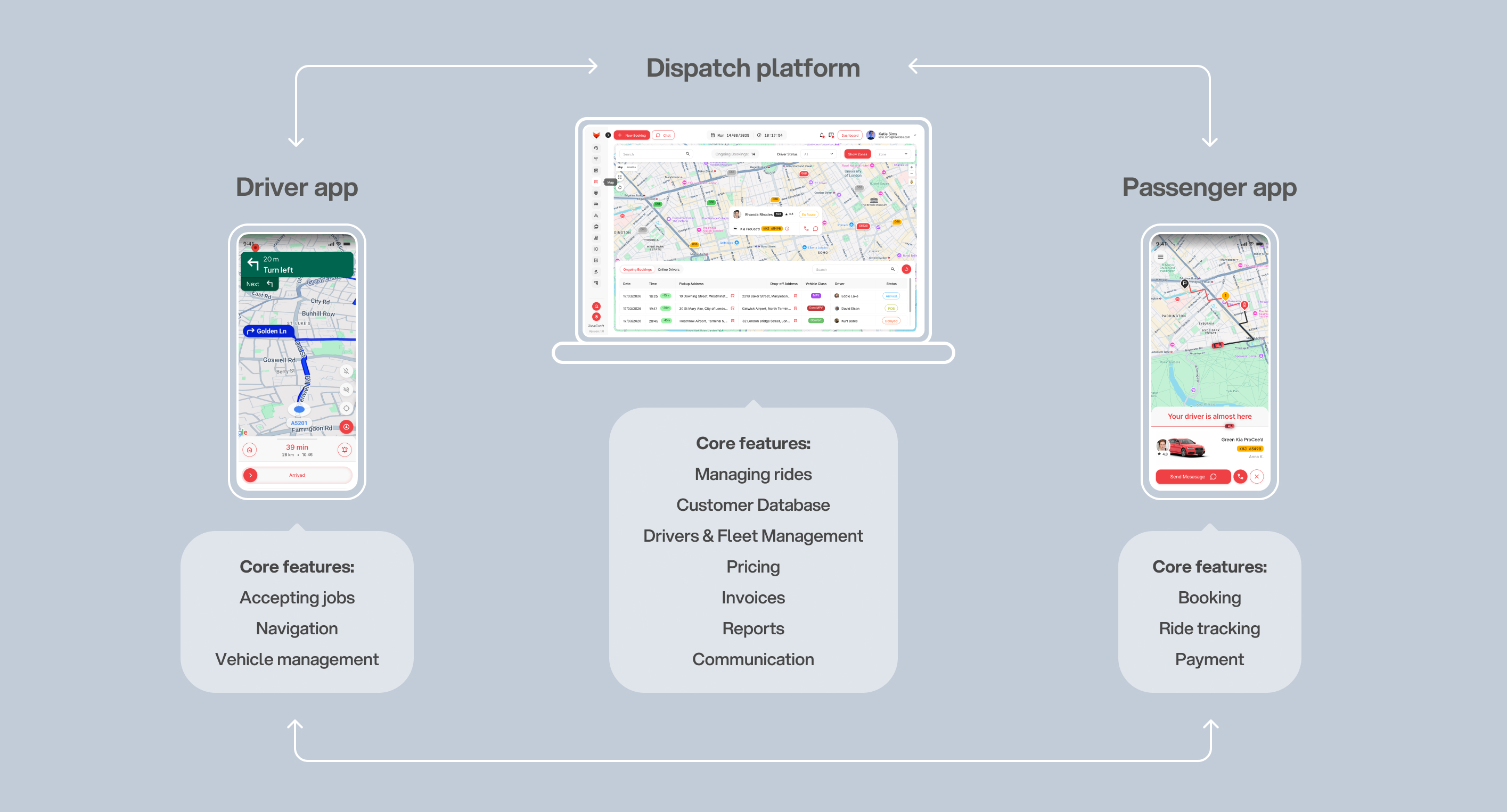
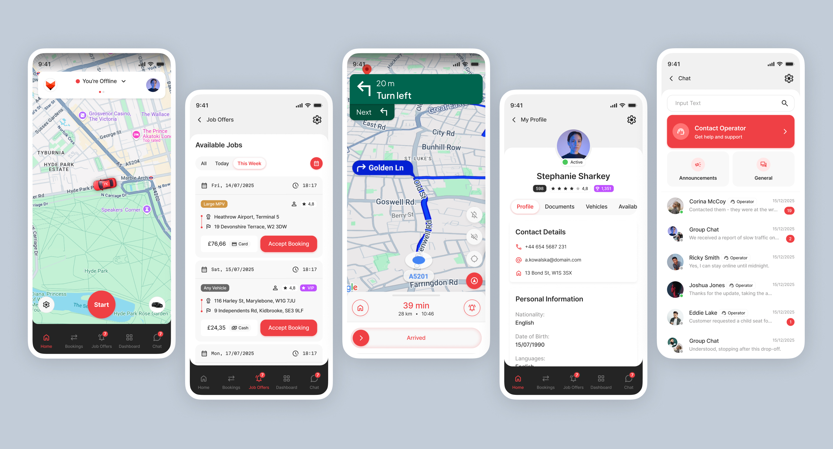
Cross platform experience
Different users required different UX priorities.
Dispatcher → operational density
Driver → speed & low distraction
Passenger → simplicity and familiarity
Despite platform differences, interaction patterns and system logic remained consistent across the ecosystem.
Dispatcher → operational density
Driver → speed & low distraction
Passenger → simplicity and familiarity
Despite platform differences, interaction patterns and system logic remained consistent across the ecosystem.
Outcome
The platform successfully passed UAT validation and received strong early reception during pre-release demos and industry events.
Feedback suggested strong confidence in the operational workflows and overall product direction.
Feedback suggested strong confidence in the operational workflows and overall product direction.
Reflection
Looking back, I would invest even more time into operator research, workflow validation and prototyping edge cases.
This project reinforced an important lesson: Designing enterprise systems is less about screens and more about creating clarity inside operational complexity
This project reinforced an important lesson: Designing enterprise systems is less about screens and more about creating clarity inside operational complexity
284
Unique web app screens
83
Unique driver app screens
70
Unique passenger app screens
+450
Design system components
83
Text styles & colors
Want to create something cool together or have any questions?
hello@iamszu.com